Continuing on from Part 1...
Class review of Exploring Fashion Design- Design 1 with Sarah Veblen.
 |
| photo courtesy of Sarah Veblen |
Day 4:
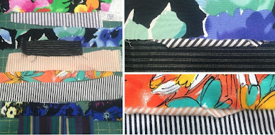
Morning: We started the morning with a lecture on fabrics, colors and composing ensembles. Sarah did another trunk show with her garments on how to create ensembles versus just having separates. This also included a lesson on using bridges for color and giving your eye a place to rest and a smooth transition between 2 fabrics or between fabric and your skin. These bridges can be piping, flat piping, lace, etc..
 |
| example of bridges used as design elements |
 |
| Playing with swatches! |
Late Morning and Afternoon: we played with TONS of fabric swatches!! Sarah had 2 giant bags of fabric swatches that she dumped on the table and she then gave us a variety of increasingly difficult fabric challenges. Between each exercise we presented them to the group and there was lots of great back and forth discussion.
- pick a solid color you like and find swatches that go from lightest to darkest in the color range.
 |
| I chose hot pink! |
- pick a solid color that you don't like and build from there using other solids and prints.
 |
| I chose tan/ecru solid in the very center. A color I never wear and find boring. |
- pick a print and find solid colors to go with it that bring out or recede the colors in the print.
 |
| Each color highlights or diminishes a color in the print. Some make the print look washed out and some make it pop. |
- find pairs of swatches that show the difference between a clear color and a greyed out color.
 |
| This was a harder exercise partly because of the available swatches. Using paint chips from the hardware store or paint shop shows this much more clearly. I look much healthier and vibrant when i wear clear colors over greyed out colors. |
- pick a boucle/tweed swatch with 3+ colors in it and build an ensemble around it.
 |
| Multi-color tweeds and boucles offer many options! |
At the end of the afternoon we then each had time to present fabric that we had brought with us and that we were unsure as to what to do with it. This resulted in another wonderful brainstorming session allowing myself to think about ideas outside of my normal train of thought.
 |
| Example of group brainstorming session with a fabric Wendy brought with her and was unsure how to use. |
Lessons of Day 4: Do not be afraid of experimenting with color, texture and prints. Take the time to audition multiple possibilities before making a decision.
Day 5:
Early Morning: Started the morning off in lecture format on how to tie everything that we have learned so far together.
re-cap of the tools we have learned so far:
- use of personal croquis; accurate body depiction
- sketching tools
- increasing knowledge of interrelationship of colors, texture and prints
- increasing knowledge of fabrics. Fabric types and characteristics
- use of your eye; allowing yourself to appreciate something beautiful and see the reason why you find it so appealing. These forms often come out in your design work at some point in time.
We also had a great discussion of learning to trust the process and of working in a mindful manner. This is something that I have been working on in all aspects of my life, bringing that calmness into my design process will be a wonderful experience.
Rest of the day: Spent at
A Fabric Place/Michael's Fabrics
We were each given specific exercises to be done at the fabric store that required the gathering of many swatches. I loved that Sarah gives individualized exercises tailored to your own needs versus just generic things to do!
 |
| Just a small sample of the lovely fabrics at A Fabric Place. I was so engrossed in my exercises that I forgot to take pictures! |
My specific fabric exercises were:
1.Find fabrics that I can use in a monochromatic non-color scale. this was a good challenge for me since I always wear color! I choose to go with a grey palette and found this to be a bit anxiety producing to begin with. I was really surprised at this reaction within myself! I just took the time I needed and cut about 20 swatches in the grey family and I now have a newfound appreciation for this lovely neutral. Later in a group exercise we determined what range of grey I could actually wear.
 |
| The greys that I choose for my palette, there were more but were rejected for being too brownish and too bluish. |
2. Find fabrics to make a skirt out of a print with some sort of stripe at the bottom. I like stripes but found that I have a hard time using them without looking silly. I really enjoyed this one! I brought a couple sketches of skirts that I had done to help me better visualize the fabric combinations. Michael's has so many beautiful and high quality fabrics to choose from.
 |
| So many options! |
 |
| My favorite of the bunch! |
3. Swatch solid colors and textures to go with a Jackson Pollockesque linen that I had brought with me. Again this was very interesting. I had an idea in my head of what I would use but then when I let myself really be open and look at the possibilities of different fabric/color combinations I found many intriguing ideas.
 |
| On the left are all the swatches I chose to go with the main fabric. On the right were my favorite three! |
4. Using a silk chiffon print I brought with me, find a fabric to use with it. I found it easier to think in terms of design. I had sketched out a princess sheath dress with gathered chiffon sleeves and neckline detail and used that sketch to help drive my decision. I ended up with a fabric that complemented the overall color of the chiffon and allowed the print on the chiffon to be the standout rather than matching a fabric to an actual print color on the chiffon, which is what I was initially inclined to do!
 |
| This one is quite hard to see in the photo. Photographing the chiffon print to really show off it's properties is not easy! on the left are the initial swatches. I was initially really drawn to the green wool. however the contrast is very high and I really wanted something more complementary. The fabric I choose on the right really is amazing with the chiffon! |
5. Find a camel color that I can wear- did not get to this :(
6. Swatch multiple floral chiffons from pastels to jewel tones to find what I like and what works well with my coloring.- did not get to this :(
7. Using another fabric I brought with me, red and black jacquard with woven circles, find something to go with it. This was the last challenge of the day that I did and I found it FUN! I started with playing with a laser cut neoprene to go over the fabric to tone it down and give it more interest. (thanks to my friend Wendy who pointed out the laser cut fabrics to me!) This was not even on my radar to do. I liked the red/black fabric but with the laser cut over it, now I LOVE it! Really allowing myself to be open to possibilities let me 'see' the options. I also choose a beautiful dark grey wool with red and black pinstripes to make an accompanying garment.
 |
| This is going to be a wonderfully fun project! |
Lunchtime: we spent some time reviewing exercises in group discussion while we waited for our food! Then back to the fabric store for several more hours of fun.
 |
| One of Wendy's exercises was to find a peachy/coral color that she can wear. Wendy tends to shy away from many colors and the color and print on her shoulder looks so lovely! |
Late afternoon: we reconvened at Sarah's studio to review our fabric purchases and share why we bought them. Of course we also shared a well deserved bottle of wine!
Lesson of Day 5: Take my time at the fabric store! Allow myself to explore options, bring fabric that I am trying to coordinate, bring sketch ideas and just slow down and take it all in.
Day 6:
Wow! time just flew by. I couldn't believe we were on the last day of the class.
Morning: We started off with finishing up the sharing of our fabric exercises. So interesting to see what other people do and why!
Lecture and trunk show was next with the emphasis on the use of trims.
(lack of photos due to tired brain!)
I have a hard time with trims except on french jackets. I always feel like they look like an afterthought and just stuck on or too juvenile. Sarah described her process and I can see where the use of trims done in a thoughtful way can add an unexpected design detail to a garment. This is something that I will have to explore. We shared trims that we each brought and discussed usage of them and buttons as well.
One very lovely lady, Joyce, actually had several trims that she wanted to give away. I came home with 2 lovely pieces that I will try to incorporate.
 |
| The three beautiful trims that came home with me! The gray and blue/gold were from Joyce! |
Afternoon: Sarah discussed with us as a group how to begin to translate these designs that we have sketched into actual garment designs. She believes that with 4 well fitted master patterns you can get to almost any design. These master patterns are: Princess line top, side bust dart top, pants and skirt. We then went around the room and she took a sketch from each of us and talked through how to make it happen using paper and pencil to aid her. After just seeing her do this a couple of times my mind automatically started putting them together. How lovely to be free of commercial patterns and endless fitting muslins!
 |
| Rough sketch of how to re-work a princess seamed pencil skirt to add a contrasting side angled flounce going across several panels. |
The day wrapped up by Sarah spending individual wrap up time with each of us.
 |
| Photo courtesy of Sarah Veblen |
Lesson of Day 6: Use the tools that we have been taught throughout the week to further our design growth. -Positive body image - Personalized croquis - Sketching tools - use of Color - use of Fabrics -Purposeful design - Allowing myself to play.
I flew home with Wendy the next day and we were like excited school girls eager to share our ideas and insights with each other! Truly a great class!!


