Friday, February 23, 2018

In The Sketchbook- February 2018

Welcome to In the Sketchbook, a monthly look at fashion design sketches that we are working on for ourselves. Sketching garments on a personal croquis is a great way for the individual couture enthusiast to move beyond the use of commercial patterns and into a world of personalized design! It can be intimidating at first, but with a little bit of practice it becomes something you look forward to. Join us for a look of what we have going on In the Sketchbook! Brought to you by Wendy Grossman of Couture Counsellor and Steph King from Siouxzeegirl Designs.


This month, I am playing with sleeve designs.

I drew some of my inspiration from photos that I have taken and have in an 'Inspiration' folder on my computer. Sleeves are a great place to add in detail. I have spent much time in perfecting the fit of my basic sleeve and now that I have fit down, I feel like it is time to really play with design.

Each of my sketches are done in half. Meaning I sketched one design on the right and another on the left. 


These first two are of different set in sleeve types.
On the left we have a gathered sleeve head with a button vent at the wrist and on the right we have a very traditional smooth inset 2 piece sleeve with a split vent at the wrist. 

I did not draw these from any photos, just from my head as they are 2 variations on a simple design.

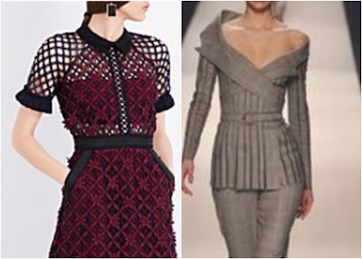
these are sleeves from the bodice of different contemporary dresses.
On the left is a raglan sleeve with trim at the short sleeve hem. The photo is with a geometric lace, I just drew it as a solid.  On the right is an off the shoulder sleeve that comes from bands across the bodice. A strange looking top, I cant tell if it is purposely asymmetric or if the left side is just falling off the models shoulder... Maybe a little of both!


Both of these sleeves were taken from paintings in museums. Both of them incorporate a large amount of lace.
On the left you have a double tiered lace flounce with the upper sleeve and bodice overlay in a sheer material, the band on the off the shoulder neckline matches the band attaching the lace flounce to the sleeve.
On the right you have a more modest design with a very structured bodice and large lace flounces around the neckline and forming the bottom half of the sleeve.


These were photos taken at the V&A in London.
On the left is a type of Juliet or Leg-of-Mutton sleeve and the right is a sort of Bishop sleeve with a lot of fabric manipulation going on
.


These are both taken from more contemporary designs as you can see in the photo below.
The left photo is an updated and clean looking version of a bishop, especially when compared to the bishop sleeve in the previous sketch/photo above. The Sleeve on the right looks well enough while the arm is straight and hanging softly by the body. I'm not sure how good it would look say while in a business meeting and taking notes on an iPad. It is interesting enough to maybe make a mock up of.


More photos from the V&A.
The left is a sort of  layered Kimono which is very, very pretty! Although I'm certain that unless you had on some super corset you could not attain that shape! On the right is a very cool play with stripes using a mild puff sleeve.


These were photos taken at the V&A as part of the Balenciaga exhibit. (they are NOT Balenciaga)
Both of these are what I would call extreme sleeves. Very cool, very runway and not practical at all!
However, they were fun to adapt to my shape using my croquis!


More from the V&A!
The design on the left really had me itching to get into the case and see what was really going on with that sleeve! From my view and the photo it looks like it is an organza that has been gathered and only attached at the sleeve head. It looks cool but I cant quite figure out what is happening in the lower part....
The sketch and photo on the right are of a cut on sleeve. I really like the look of this. I keep thinking it would be fun to develop one for myself. However, it would need to be impeccable like this one and i'm just not sure how that would look in motion. Fine as it is standing perfectly motionless on a mannequin where a curator finessed the drape and folds to be perfect! in real life would it just look like a baggy mess???


The sleeve on the left is really just made up of bodice with a cut on sleeve and then wide bands of fabric joining the front and back together. An interesting concept.
The short sleeve on the right is a trickier one. Hard to tell from the photo if it is clever pattern work with origami like folds to create the look or if it is separate pieces. Would love to get my hands on this to give it a good look over!


These last 2 are mens clothing from the l700's.
I mostly decided to sketch these because I am fascinated with where the heck the shoulder are! This silhouette is so different from what is current. the sleeve is very narrow and shaped to the arm, the sleeve is set in very far out with the cut of the upper chest being very wide. I am very curious to know if they stuffed or wore some special shoulder pads to make the shoulders so sloped. These sleeves are 2 or piece sleeves and the under sleeves are cut on the bias.the one on the left has a separate cuff sewn on that was cut on the cross grain. the on eon the Right has no discernible separate cuff. Just a vent.


My idea in using photo's to sketch from was that I would play with ideas that I would not normally gravitate to and this would help increase my sketching and rendering skills. It has and it has been fun, I've been diligently checking out sleeve designs every where I look! It has also seemed to let some of these alternative shapes seep into my imagination and have shown in up in other designs that I have been working on. 

Make sure to stop by Wendy Grossman of Couture Counsellor to see what lovely sketches and ideas she is working on. Please feel free to share your sketches and ideas with us.


Happy Sketching!


No comments:

Post a Comment

comments, thoughts, idea? Please share!